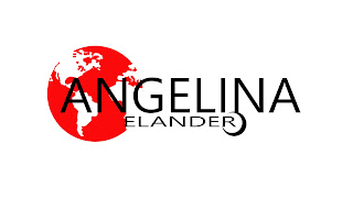
New logo
I have been working on a new logo for months actually and elaborated with different designs. Wanted to stick to the color theme I got going here with black, white and red, and possibly green. But red, white and black is a classical combination that always works. I consulted a friend a few months ago regarding what he though was the best of these three options. He voted for the "eight ball" around the R, Logo 3. It's not meant to be an eight ball, but I can see how it may look like that. I see it more as a shard that symbolizes the registered trademark R, without actually having to add that extra R to the logo. So, I would much appreciate if you offered your opinion on which version you like the best. They can of course also be combined, but that would perhaps be too much red?
 |
| Logo 1 |
 |
| Logo 2 |
 |
| Logo 3 |
Comments
Post a Comment